Elevate your 3D animations, storyboards, and animatics with these essential tips for composing compelling CG layouts, brought to you by the expertise of a senior layout artist from Sony Pictures Imageworks.
Layout is the crucial first step, where the visual narrative is crafted. A well-executed layout seamlessly guides the audience, while a poorly planned one can unintentionally disrupt their focus. Effective camera planning is key to keeping the viewers engaged with the story.
This article explores some rules for creating better camera layouts. The initial tips cover fundamental concepts applicable to various forms, including storyboarding, creating animatics, and even live-action film editing. Subsequent tips delve deeper into specifics of layout work for 3D animation.
1. Use Camera Height to Convey Character Power

When the camera offers a high-angle perspective, looking down on the subject, the viewer perceives a sense of dominance. A high camera angle can portray a character as powerless or less significant.

Conversely, a low-angle shot from beneath eye level makes a character appear dominant and imposing. Alternating between low and high angles can effectively illustrate the power dynamics within a scene.
2. Use Camera Alignment to Control Viewer Engagement

A POV (Point of View) shot invites subjectivity. Placing the camera on-axis with the character pulls the viewer into a first-person perspective. In a conversation scene, alternating POV shots can heighten the emotional connection between characters or amplify conversational intensity.

A profile shot offers objectivity. With the camera positioned perpendicular to the characters, the viewer assumes a third-person perspective, observing the conversation from a distance.
Combining both perspectives allows for strategic manipulation of visual intensity throughout a scene.
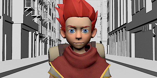
3. Use Long Lenses to Bring Characters Together


The lens choice significantly influences the viewer’s perception of space. A wide lens (under 35mm focal length) compresses space, while a long lens (over 70mm) expands it.
This affects how the viewer perceives the relationship between a character and their environment. In the images above, the characters occupy identical positions within the scene, yet the long lens – in this case, a 150mm lens – makes the robot appear to stand directly behind the boy.
Another key difference is depth of field. Wide lenses have a shallow focus compared to long lenses, which is helpful when isolating a character from their background.
4. Framing Characters: Do’s and Don’ts

Always leave some headroom above the character’s head. To avoid a cramped appearance, maintain a minimal space. More headroom suggests the character’s relative smallness. If the head touches the frame, it’s better to focus on a tighter shot of the face. Cropping off the forehead can often look normal.

If a character is looking to the side, provide space in front to accommodate their gaze. The more in profile, the more “nose room” is needed – often called “lead room” or “looking room”.

In close-ups, avoid framing the edge of the frame through the character’s neck, as this can appear as a decapitated head.

Similarly, passing the edge of the frame through a character’s joints like knees, elbows or ankles creates an uncomfortable illusion, feeling like a missing body part. To fix this, either widen the camera shot or cut in closer.
5. Follow the 180-Degree Rule

Appropriate camera placement eliminates audience confusion about scene orientation and direction. Consider this overhead view of two characters facing each other. Let’s draw an imaginary line.

If you stay on one side of the line for your camera shots, scene cuts will flow seamlessly.

However, if the camera crosses the line, continuity breaks down: characters will appear to jump from one side of the screen to the other, and appear like they are no longer looking at each other.
6. The 20% and 30-Degree Rules for Consecutive Shots

Using similar camera angles or fields-of-view for two successive camera shots creates a “jump cut,” a jarring change in continuity that alerts the audience to the switch. Film-making usually avoids this, unless the effect is deliberate.
To sidestep a jump cut, adhere to the 20% and 30-degree rules: Ensure a subject size change of at least 20% and an angle shift of 30 degrees when editing between cameras. In the diagram above, the cut would look natural between two blue cameras, while cutting between blue and red would cause a jump.

For instance, images A and B provide enough difference in size and angle to make the cut natural, but A and C are much too similar. Editing A and C together will produce a jump cut.
Similarly, avoid using the same lens from one shot to the next.
7. Organize Cameras by Grouping

When a camera must move in more than one axis, it helps to group its properties in your 3D software. Generally, define a group comprising: the master control, translate, rotation, shake and the camera itself. Each has a specifically defined role. For example, only key translate nodes at the translate level.